博文
Nature Methods:数据统计P值的代替方法--估算作图
||
Moving beyond Pvalues: data analysis with estimation graphics
First author: Joses Ho; Affiliations: Institute for Molecular and Cell Biology (分子与细胞生物学研究所): Singapore, Singapore
Corresponding author: Adam Claridge-Chang
To the Editor — For at least 77 years, the limitations of null-hypothesis significance testing (NHST) have been discussed, without agreement on a suitable alternative. Estimation methods that estimate effect sizes and their uncertainty have great potential to shift the current data analysis culture away from dichotomous thinking and toward quantitative reasoning. Although NHST limits the analyst to the ill-conceived question of “Does it?”, estimation instead draws the analyst’s attention to the question of “How much?”—the very topic that defines quantitative research. Here we describe the estimation graphic, a plot that displays an experimental dataset’s complete statistical information. We also introduce software that makes high-quality estimation graphics available to all.
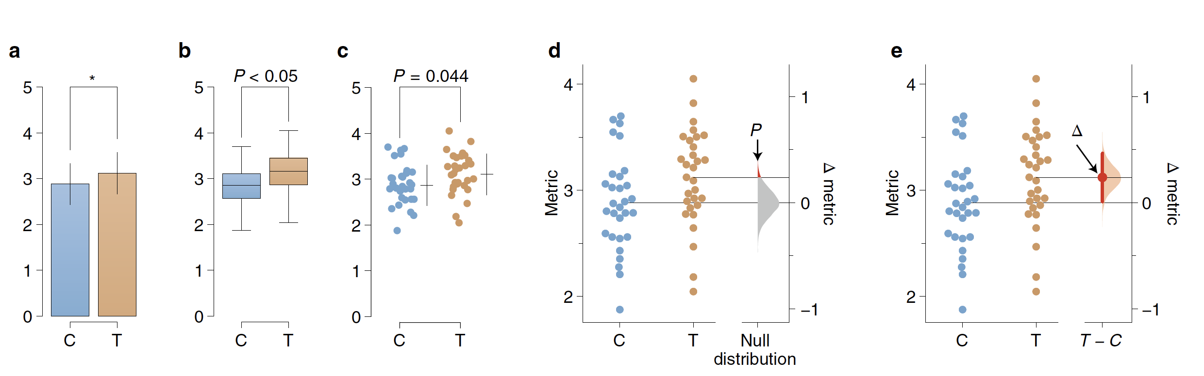
An experiment that uses control and intervention samples, the two-group design, is traditionally analyzed with Student’s t-test (Supplementary Note 1). The t-test assume that both groups have identical means, that is, that the effect size is zero. It then ‘challenges’ this null hypothesis with the observed data, by calculating the chance of seeing the observed effect size (or greater) within the hypothesized null distribution— this is the P value. If the probability is below a certain threshold (typically P < 0.05), the null hypothesis is rejected. The analyst then plots the two groups’ means in a bar chart and denotes ‘significance’ by marking it with an asterisk (Fig. 1a). This visualization has two important deficiencies. First, by displaying only the means and width of their errors, a bar chart obscures the observed values. Box plots likewise (Fig. 1b) do not display complex attributes (for example, bimodality) or the individual values. Second, NHST plots show only the test result (as indicated by an asterisk or a P value), while omitting a diagram of the null distribution itself. The omission of both the full dataset and distributional information in t-tests reflects how NHST— by focusing on an accept/reject dichotomy— diverts attention from effect quantification. A more transparent approach uses dot plots that show every datum (Fig. 1c); these are best drawn as ‘bee swarm’ plots, which convey histogram-like information about the distributions (Fig. 1d). The two groups’ comparison can be highlighted by a difference axis (Fig. 1d). The NHST version of this design has three main features: (1) the mean of the null, by definition, is the difference-axis origin, zero; (2) the origin is flanked by a sampling-error distribution; and (3) the P value is visualized as the tail segment of the distribution that is more extreme than the observed effect size. If this tail segment is smaller than a predefined significance level, traditionally α = 0.05, an analyst will reject the null hypothesis.
Although visualizing the null distribution is an improvement, this picture nevertheless illustrates NHST’s flawed logic: to ‘prove’ that the null hypothesis is false, the analyst must invoke the existence of something (the tail segment) that the hypothesis itself predicts1. Even the premise of NHST is unrealistic: any intervention to a system will produce some (at least infinitesimal) effect; thus a hypothesized effect size of precisely zero is inevitably false.
For the analysis of two groups, the best design is a plot that visualizes the effect size. Here the difference-axis origin is aligned with the mean of the test group, which makes it easy to relate observed values to the difference of means, Δ (Fig. 1e). Around Δ, the analyst plots an indicator of precision known as the 95% confidence interval (CI). In our visualization, the sampling-error distribution is diagrammed as a filled curve, granting it visual emphasis.
Compared with conventional NHST plots, estimation graphics offer five key advantages. (1) Plotting the full samplingerror curve of the effect size prevents dichotomous thinking and draws attention to the distribution’s graded nature. (2) The difference axis affords transparency of the comparison being made. (3) Whereas P values conflate magnitude and precision in a single number, the relative size of a CI provides a specific measure of its precision. (4) Deriving this sampling-error curve with bootstrapping makes the method robust and versatile (Supplementary Note 2). (5) Most important, by focusing attention on an effect size, the difference diagram encourages quantitative reasoning about the system under study.
To make estimation graphics easily accessible, we developed DABEST (‘data analysis with bootstrap-coupled estimation’): open-source libraries for Matlab, Python and R. We also built a user-friendly web application, available at https://www.estimationstats.com (Supplementary Notes 3 and 4). DABEST can be used to visualize large samples, paired data, multiple groups and sharedcontrol designs (Supplementary Fig. 1), and to display standardized effect sizes such as Hedges’ g. More generally, estimation-focused plots can be used for linear regression (Supplementary Fig. 2) and for meta-research, such as with forest plots. As a replacement for NHST, estimation graphics are readily used and broadly relevant.
致编辑:至少70年以来,人们一直在讨论零假设显著性检验(null-hypothesis significance testing, NHST)的局限性,但一直没有形成统一的意见,选择何种方法来代替NHST。估计数据有效大小及其不确定性的估算方法能够将目前的数据分析分化从是-否二分法思维中抽离出来,并转向量化的思维观点。NHST将数据分析局限在“是/否”存在差异的层面上,相反估算方法能够将分析者的目光吸引在差异的“程度”问题上,而这正是定义量化研究的最重要的一点。本文中,作者引进了一种估算作图的方法,能够可视化试验数据全面的统计信息。同时,作者开发了能够制作高质量估算作图的工具,并且对所有人开放。
通讯:Adam Claridge-Chang (http://www.claridgechang.net/people.html)
个人简介:1991-1995年,澳大利亚国立大学,学士;1996-2002年,洛克菲勒大学,博士;2003-2004年,Sloan-Kettering研究院,博士后;2004-2007年,耶鲁大学医学院,博士后。
研究方向:果蝇行为神经遗传学。
doi: https://doi.org/10.1038/s41592-019-0470-3
Journal: Nature Methods
Published date: June 19, 2019

https://blog.sciencenet.cn/blog-3158122-1186170.html
上一篇:Nature Reviews Genetics:植物光合作用的趋同演化(综述)
下一篇:Communications Biology:植物LEAFY基因家族的系统演化分析
全部作者的其他最新博文
- • Plant Physiology:CsMADS3促进柑果中的叶绿素降解和类胡萝卜素合成(华中农业大学)
- • Molecular Plant:LBD11-ROS反馈调节作用于拟南芥的维管形成层增殖和次生生长(浦项科技大学)
- • Science Advances:根结线虫通过调控植物的CLE3-CLV1模块,促进侵染进程(日本熊本大学)
- • Nature Communications:油菜素内酯参与植物营养生长期转变的分子机制解析(浙江农林大学)
- • Current Biology:光合作用产生的蔗糖驱动侧根“生物钟”(德国弗莱堡大学)
- • PNAS:花同源异型基因在叶中被抑制、花中被激活的分子机制(南卡罗来纳大学)