博文
基于ggplot2的散点图
||
参考资料:
1)https://ggplot2.tidyverse.org/reference/geom_point.html
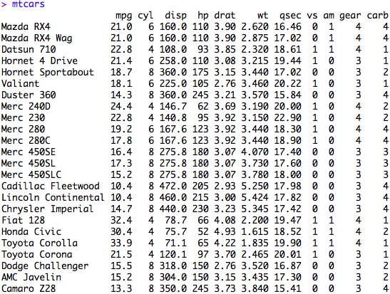
数据来源:用ggplot2自带的mtcars,格式如下:
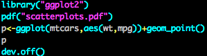
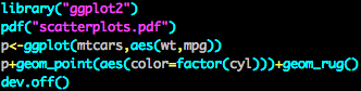
画图代码1:
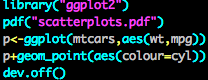
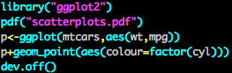
画图代码2: 散点加颜色(渐变),散点加颜色(离散)
画图代码3:散点加形状(必须用离散变量)

画图代码4:散点大小控制

画图代码5:散点透明度控制

画图代码6:添加回归线,同时可通过geom_smooth()中的method参数去控制回归线
� �
�
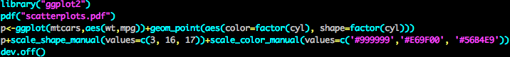
�画图代码7:点颜色、形状、大小的修改与控制,这个需要geom_point有color、shape等参数,
scale_shape_manual()、scale_color_manual、scale_size_manual等才能进行修改
�
画图代码8:控制轴须
� �
�
https://blog.sciencenet.cn/blog-306699-1142763.html
上一篇:Seasonal cycling in the gut microbiome of the Hadza图1的实现
下一篇:多张图合并的策略