博文
MATLAB中绘制数据直方图的新函数histogram2
||
MATLAB中有命令hist3() 可以绘制直方图,竖坐标是频数,这与一些教科书中用纵轴表示频率的做法不一致,有些时候不便于使用。当然,使用者可以自己编写定制能够在纵轴绘出频率的直方图。在MATLAB中,增加了具有复杂功能的绘制数据直方图的新函数histogram2().
在MATLAB2015b测试环境下,MATLAB代码和图形如下:
一、绘制数据直方图的新函数histogram2
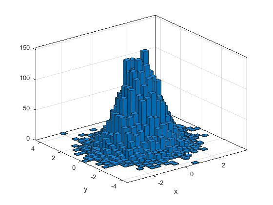
x = randn(10000,1);y = randn(10000,1);h = histogram2(x,y)
xlabel('x'), ylabel('y')
x = randn(1000,1);
y = randn(1000,1);
nbins = 5;
h = histogram2(x,y,nbins)
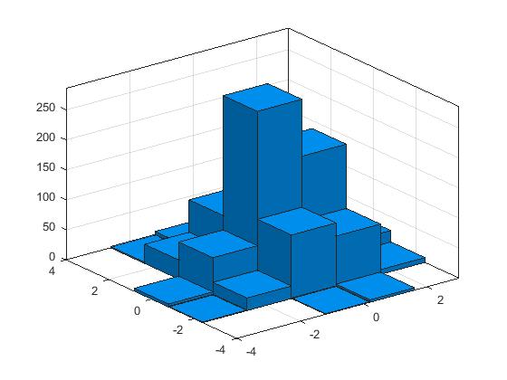
>> counts = h.Values
counts =
0 1 5 0 0
0 21 62 32 2
1 106 286 86 7
4 84 191 64 1
0 8 27 12 0
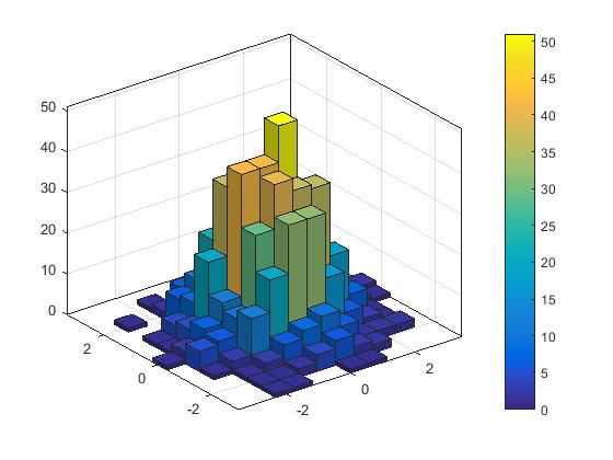
>> h = histogram2(randn(1000,1),randn(1000,1),[12 12],'FaceColor','flat');
colorbar
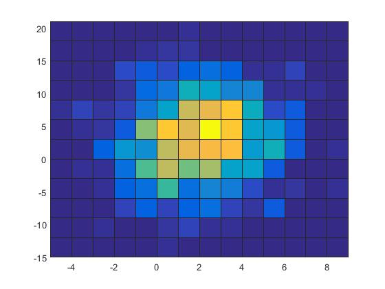
>> x = 2*randn(1000,1)+2;
y = 5*randn(1000,1)+3;
h = histogram2(x,y,'DisplayStyle','tile','ShowEmptyBins','on');
x = randn(1000,1);
y = randn(1000,1);
h = histogram2(x,y,'Normalization','probability')

https://blog.sciencenet.cn/blog-292361-1054200.html
上一篇:MATLAB中绘制数据直方图的新函数histogram
下一篇:MATLAB中计算凸多边形面积和凸多面体体积的简便方法